Google UX Certificate · E-commerce · Mobile App
An Online Florist Built Around the Gift, Not the Purchase
A Hyderabad florist had a loyal customer base and no digital presence. COVID changed that overnight. I designed a mobile app that replicates the personal florist experience online, live inventory, bouquet customization, and a checkout built for gifting.
The challenge: Flowers are tactile and personal. Make an app that feels like the florist knows you, not like a generic e-commerce checkout.
Case Study- No digital presence for a foot-traffic-dependent business
- No way to show live inventory or customize orders online
- Customers buy flowers for others on a deadline under pressure
- Live inventory browsing with real-time stock signals
- Bouquet customizer with live preview
- Delivery scheduling surfaced before you build your bouquet
- Customization flow reduced to 4 steps through testing
- 3 rounds of iteration based on observed behavior
- Checkout sequence reordered after round 2 revealed critical flaw
01 · Context
A florist with no digital presence, in the middle of a lockdown.
Build a mobile app that brings the in-store florist experience online without losing what makes it personal.
Small florists in Hyderabad were entirely foot-traffic dependent. COVID-19 hit and in-person shopping stopped. Loyal customers had nowhere to go.
End-to-end UX project: research, information architecture, wireframes, usability testing, and final prototype.
This was completed as part of the Google UX Design Professional Certificate, but the problem was real.
Small florists in Hyderabad were entirely foot-traffic dependent. No app, no website, no way to take orders online. When COVID-19 hit and in-person shopping stopped, loyal customers had nowhere to go. Aura was designed to fix that.
The project was completed as part of the Google UX Design Professional Certificate. A local florist, a real customer base, and no digital solution. I took it from zero.
02 · My Role
Sole UX designer, research through final prototype.
As the only designer, I owned every phase: research, IA, wireframes, testing, and visual design. What was hard about that wasn't the workload. It was having no one to pressure-test decisions. When I moved delivery scheduling to step 1 of checkout, there was no design lead to tell me whether that was right or overengineered. I had to run the test and find out. Every major call had that same shape: form a hypothesis, expose it to real users, throw it out or keep it based on what they actually did. There was no shortcut to that process, and no one to defer to when it got uncomfortable.
03 · Research
What people actually do when they buy flowers.
Research had two phases: a screener survey to recruit the right participants (20 respondents, 5 selected based on age, flower-buying frequency, and app usage), then user interviews with those 5 participants to understand real behavior. What I found changed the whole direction of the app.
How often do people use apps for floral services, and why?
What do users expect and what leaves them frustrated?
Demographics, occasions, motivations: who actually buys flowers?
“Most people buy flowers for other people, not themselves, on a deadline, under pressure to get it right.”
- Fast mobile shopping
- Quick suggestions from a florist
- Gifting for occasions
- Flowers that match their aesthetic
- Standing in line near major occasions
- Flowers that are not fresh
- Price not matching quality
- No customization
- Fear the real product will not match what is shown
Domestic and international delivery, user accounts, add-ons.
Ordering flow too long, no customization.
Personal service, fresh stock.
Physical store only, no app, old stock during high demand.
Easy availability.
Ready-made only, no customization, no dedicated app.
Every competitor failed at the same two things: customization and trust that the real product matches what is shown. FNP buries customization in a long flow, local florists have no way to preview, and grocery stores only sell ready-made. That overlap is exactly where research landed too, ‘fear the real product will not match.’ So customization and a live preview did not become features in Aura. They became the spine of the product, which is why the bouquet builder and the real-inventory signals carry the whole design.
04 · Direction
One question that reframed everything.
“How might we help local florists offer a personalized, seamless online bouquet shopping experience that lets customers view real inventory, customize arrangements, and schedule deliveries with ease?”
The HMW reframed the project from ‘build an ordering app’ to ‘replicate the personal florist experience online.’ That distinction changed what we designed: not just a product catalog, but a guided customization flow with real inventory signals and a gifting-native checkout.
Show only what is actually available. No disappointment at checkout.
The bouquet builder is the differentiator, not just a feature buried in the flow.
Delivery scheduling, occasion messaging, and gift wrapping live front and center.
Paper let me move fast and throw a lot away. Once the structure held, I moved to mid-fidelity digital wireframes and ran round 1 of testing on those, grayscale, no real photography, just the skeleton of the flow. That round is where two problems surfaced that paper had hidden: the bouquet preview read as decoration instead of the main task, and the checkout order felt fine on paper but broke the moment people actually scheduled a delivery. Both fed straight into the screens below. The jump you see from rough paper to polished final is really three rounds of testing compressed into one image.
05 · Final Design
Four screens that do the work.
The final prototype covers the core loop: browse real inventory, customize your bouquet, schedule delivery, confirm. Each screen was tested at least twice before reaching the final form.
Home, real-time inventory
The home screen balances browsing and discovery. Real-time inventory status is baked in: grayed out means unavailable, soft tags signal low stock. An ‘upcoming collections’ section keeps returning customers engaged with what is fresh.
Create Your Own, bouquet builder
A live preview updates as users add stems. Selection is limited to current inventory. Round 2 of testing: the preview was too small. We made it take up 60% of the screen. Completion rates jumped.
Checkout, delivery scheduling up front
Round 2 revealed a critical flaw: delivery date selection came too late. Users would build their whole bouquet, then discover their date was not available. We moved scheduling to step 1 of checkout so users know their timeline before they invest in choices.
Before round 2
Browse → Customize bouquet → Add to cart → Enter delivery date → Discover date unavailable → Start over
After round 2
Browse → Select delivery date → Customize bouquet (within available inventory) → Confirm
This reversal was tested in round 3 with 5 participants. No one reached the confirmation screen in round 2 without hitting a dead end. All 5 completed the flow in round 3.
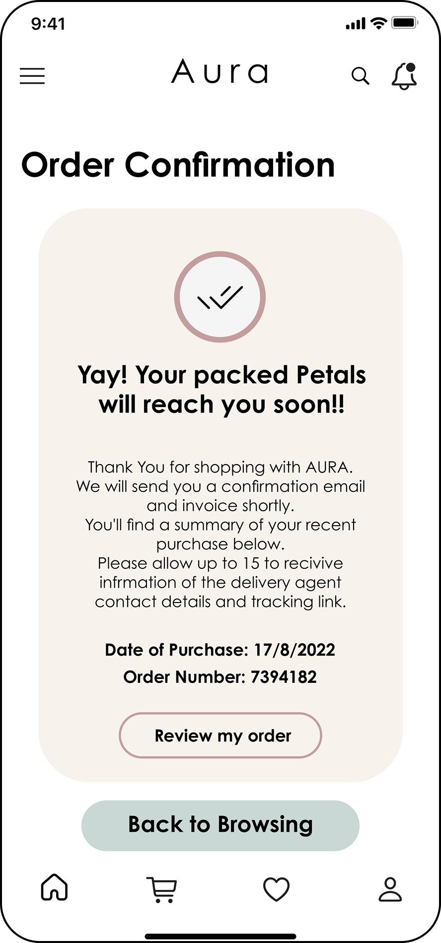
Confirmation
The confirmation screen had to feel good, not just functional. Order number, purchase date, a promise of an email receipt. The copy is warm because the whole product is about giving someone a gift.
06 · Live Prototype
Try the full gifting flow yourself.
This is the core loop: browse inventory, pick your delivery date first, customize your bouquet, confirm. The key design decision is visible in step 1: you choose your date before you build anything, so you can't invest in a bouquet and then discover it can't arrive in time.
Interactive prototype · click through the full gifting flow
07 · Reflection
The thing you think is the feature is sometimes not the hardest design problem.
I came into this project thinking I'd design a bouquet customizer. I ended up redesigning the checkout sequence after round 2 completely broke the flow. Users were building full bouquets only to find their delivery date unavailable. Moving the date picker to step 1 felt obvious in retrospect, but it wasn't. I had to watch three real users hit that wall before I was willing to restructure the whole checkout.
The hard problem was not the picker. It was learning to let what I observed override what I'd assumed. Round one: preview too small. Round two: checkout sequence wrong. Round three: it worked. Each fix came from watching people use the prototype, not from design intuition.
I'd run a mental simulation of the full gifting scenario before building a single screen: someone buying flowers for another person, under deadline pressure, on a day with limited delivery slots. That scenario would have surfaced the date-selection issue before any prototype existed. I learned to think about pressure cases first, not happy path first.