Academic Project · CU Boulder · UX Design
Designing a Wildfire Exhibit Anyone Could Use
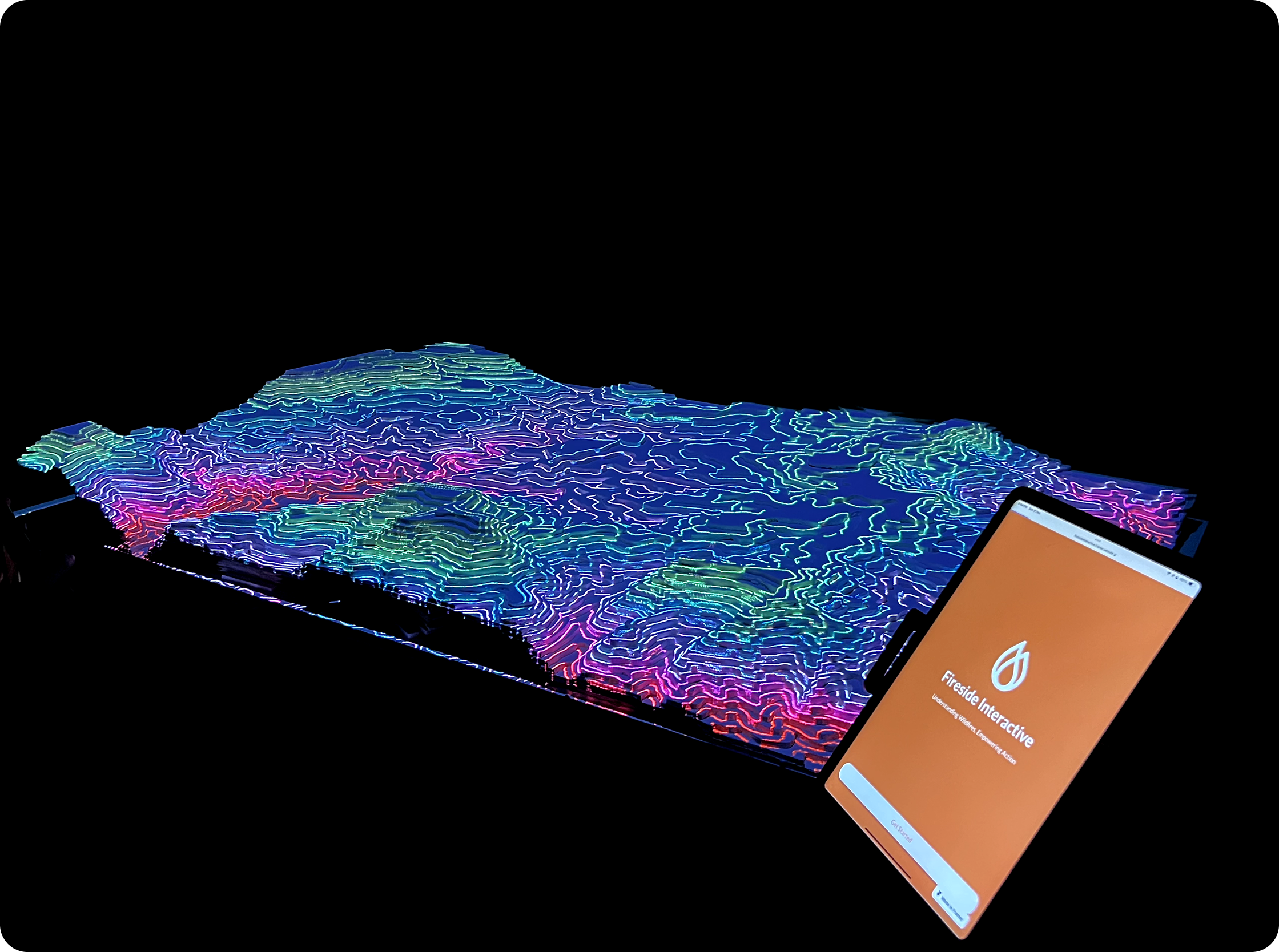
This was the first project where the interface wasn't a screen. It was a 3D topographic table with a projected display on top of physical terrain. I designed the interaction language for a wildfire exhibit that taught fire behavior to anyone who walked up, without instructions, in under 10 seconds.
The challenge: Make the exhibit immediately usable for everyone from an 8-year-old to a retired firefighter, without instructions, in a noisy museum, in under 10 seconds.
Case Study- No way to understand fire behavior without a pamphlet
- Physical table and projected interface felt disconnected
- Audience ranged from kids to fire scientists
- 3 interaction modes, each usable without onboarding
- Projection and table always tell the same story
- Spatial controls placed adjacent to their effects
- Deployed at 4 public science events
- Works for ages 8-80 with no prior knowledge
- 3 rounds of iteration, zero instruction text needed
01 · Context
A wildfire doesn't wait for you to understand it.
Wildfires are becoming more frequent, more destructive, and harder to predict. But most public education still looks like a pamphlet. The Fireside Interactive project set out to change that, by building a physical exhibit that let visitors actually experience how a wildfire spreads, not just read about it.
The project was developed as part of CU Boulder's community wildfire awareness initiative. The audience was everyone: families, school groups, firefighters, and retirees. The exhibit needed to work in a noisy science museum, capture attention in under 10 seconds, and teach something real in under 5 minutes.
Make wildfire science accessible and visceral to a general public audience in a high-traffic exhibit setting.
No instructions. The exhibit had to be self-explanatory from the moment someone walked up.
Families, school groups, educators, and fire scientists. All in the same room.
Noisy public science museums. Short attention spans. Variable lighting.
CU Boulder design team, hardware engineers, fire science researchers.
02 · My Role
UX designer for the full exhibit: interface, interaction, and spatial flow.
Interface Design
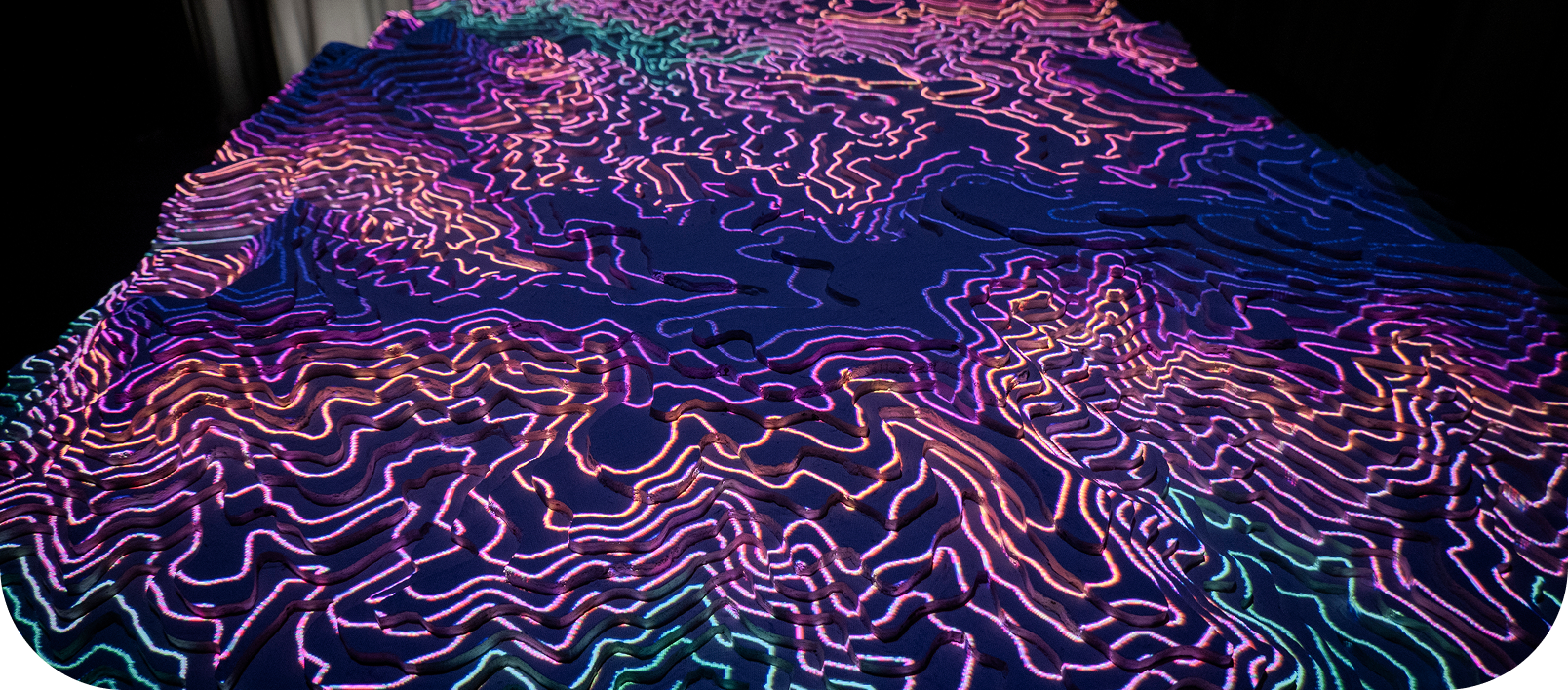
Designed the projection UI displayed on the 3D topographic table. Visual language that reads on a lumpy, curved surface.
Interaction Design
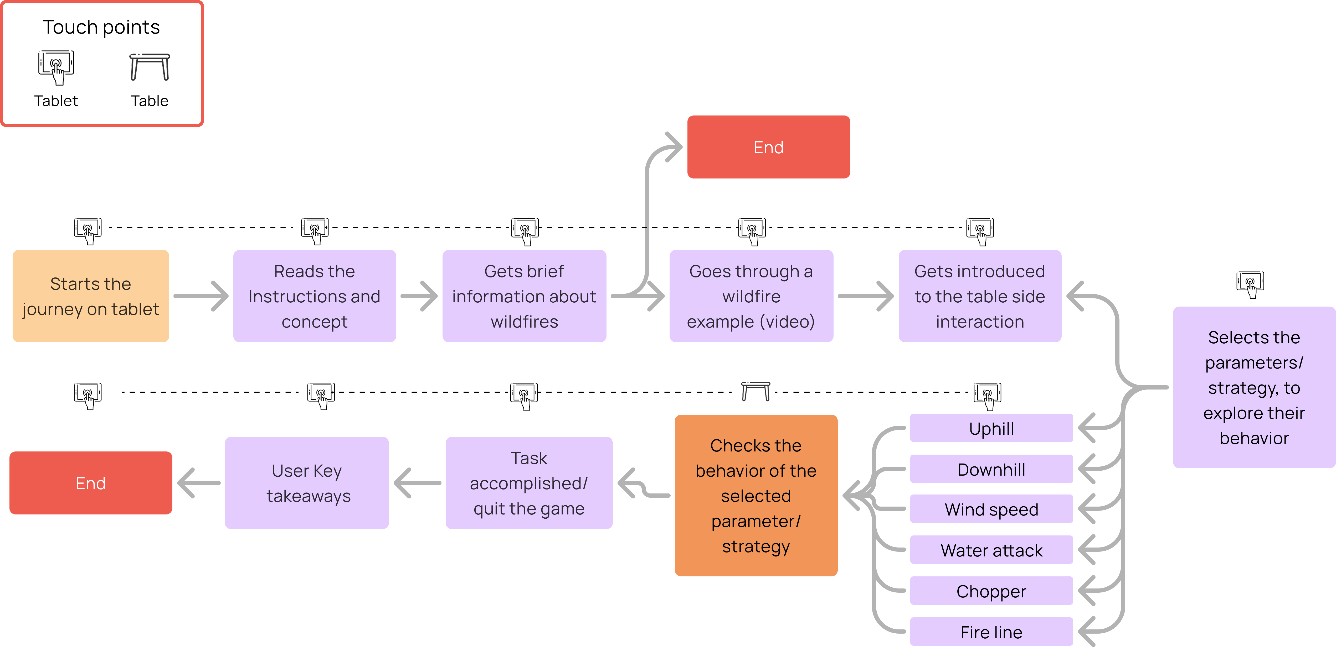
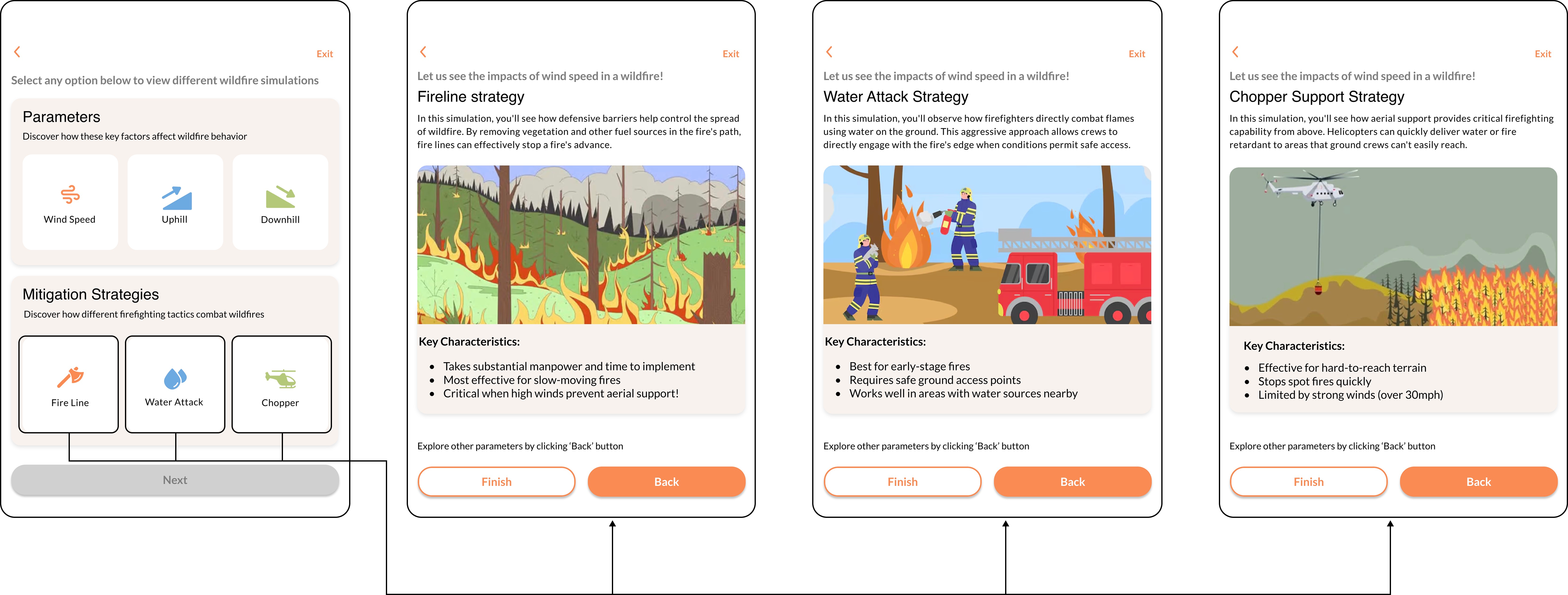
Mapped the full three-mode journey: Information, Simulation, Intervention. Defined entry points, transitions, and feedback loops.
User Research
Tested with families, high school students, and educators. Three rounds of iteration based on observed behavior, not surveys.
Spatial Design
Worked with the hardware team on control placement, table ergonomics, and the physical layout that makes cause-and-effect spatially obvious.
03 · The Solution
Three modes. One table. Zero instructions.
The exhibit runs three distinct interaction modes, each designed to work without onboarding. Visitors can walk up, start touching things, and immediately understand what's happening. The projection layer and the physical table always tell the same story at the same moment.
Information Mode
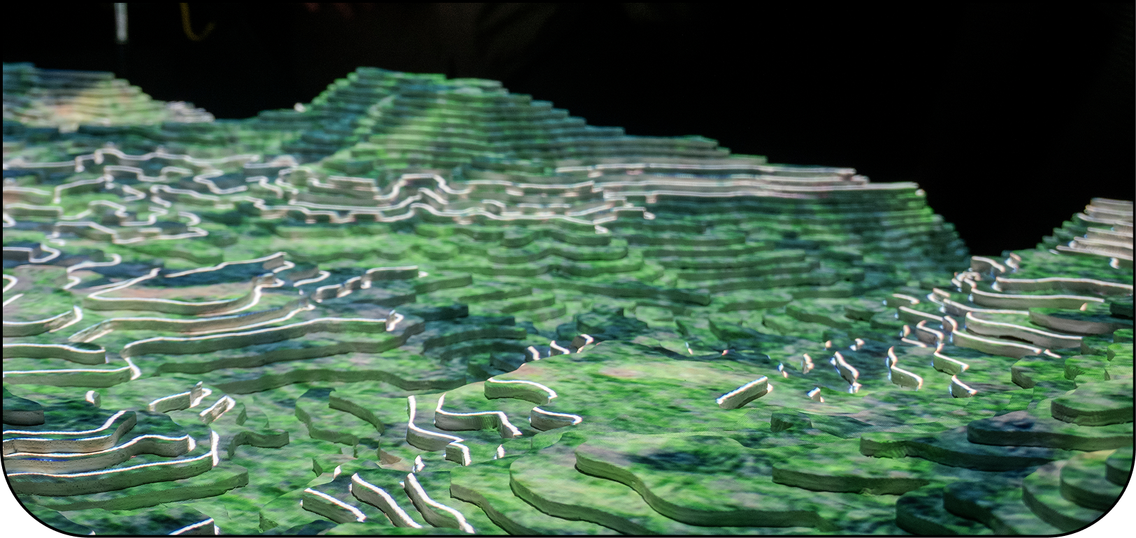
- The exhibit starts in ambient mode. Fire risk data overlaid on terrain, wind patterns animated, vegetation density visible.
- Visitors absorb context passively before interacting.
- Color encodes danger level. Motion communicates wind. No text required to get the basic picture.
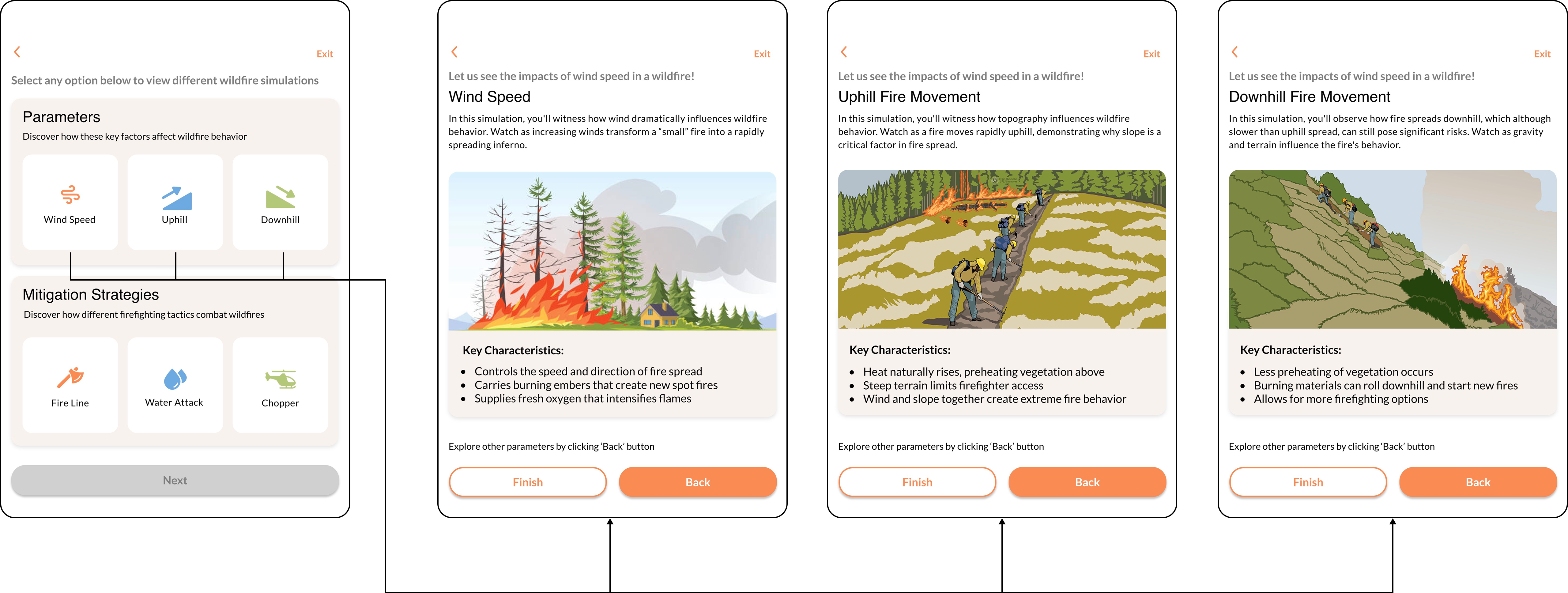
Simulation Mode
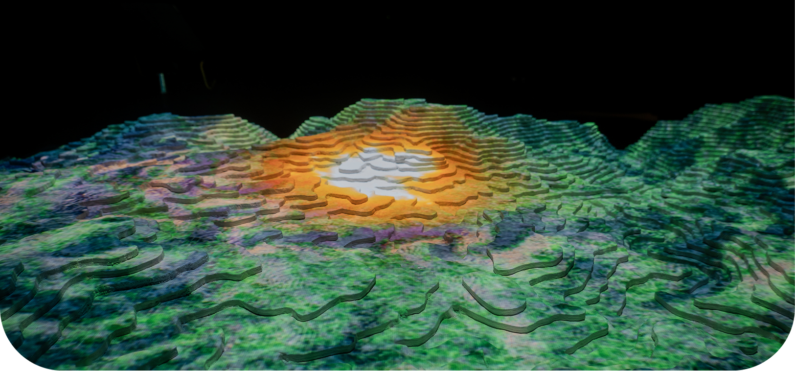
- Set environmental conditions: wind speed, humidity, vegetation. Watch a simulated fire spread across the physical terrain in real time.
- Every input has an immediate, legible consequence on screen.
- This is the moment of 'oh, that's why it moves like that.'
Intervention Mode
- A fire is already burning. Deploy suppression resources: firebreaks, water drops, evacuation routes.
- High urgency, constrained resources, real tradeoffs.
- The controls are large and forgiving. The scenarios are layered enough that someone with professional fire knowledge still finds them meaningful.
04 · User Experience
Designed for everyone who walks through the door.
The hardest constraint was the audience range. The same ten seconds of interaction had to land for a kid who can't read the labels yet and for someone who fights fires for a living, with no instructions and no facilitator standing in between.
Arrival
Ambient fire risk visualization draws visitors in from across the room. No action required, just watch. The terrain and the color language do the work.
First touch
Physical controls are at the table edge, spatially adjacent to where their effect appears. Rotating a wind dial shows immediate change in fire direction. No instruction needed.
Escalation
Visitors naturally want to try more. Simulation mode invites that. Set extreme conditions, watch fire spread fast. The system rewards curiosity without punishing mistakes.
The challenge
Intervention mode introduces stakes. A pre-set fire scenario. Limited resources. Real time pressure. Families work together. Either way it lands.
05 · Try the table
The interaction the whole exhibit was built around.
The physical table projected fire spreading across 3D terrain. You couldn't ship that in a portfolio, so here is the model it ran on, playable. Drop an ignition point, turn the wind, and watch the same cause-and-effect a nine-year-old read in fifteen seconds at the exhibit: fire runs with the wind, races through dry grass, and stalls at the firebreak.
Wind direction
70° · click the dial
Wind speed · 3
Built in React and Canvas. Click the terrain to drop an ignition point, set the wind, then ignite. Greener cells hold more fuel, the tan belt is dry grass that runs fast, and the grey strip is a rock firebreak the fire has to flow around, exactly the kind of cause-and-effect the table was built to make visible.
06 · iPad Prototype
The companion interface, for facilitators and deeper learners.
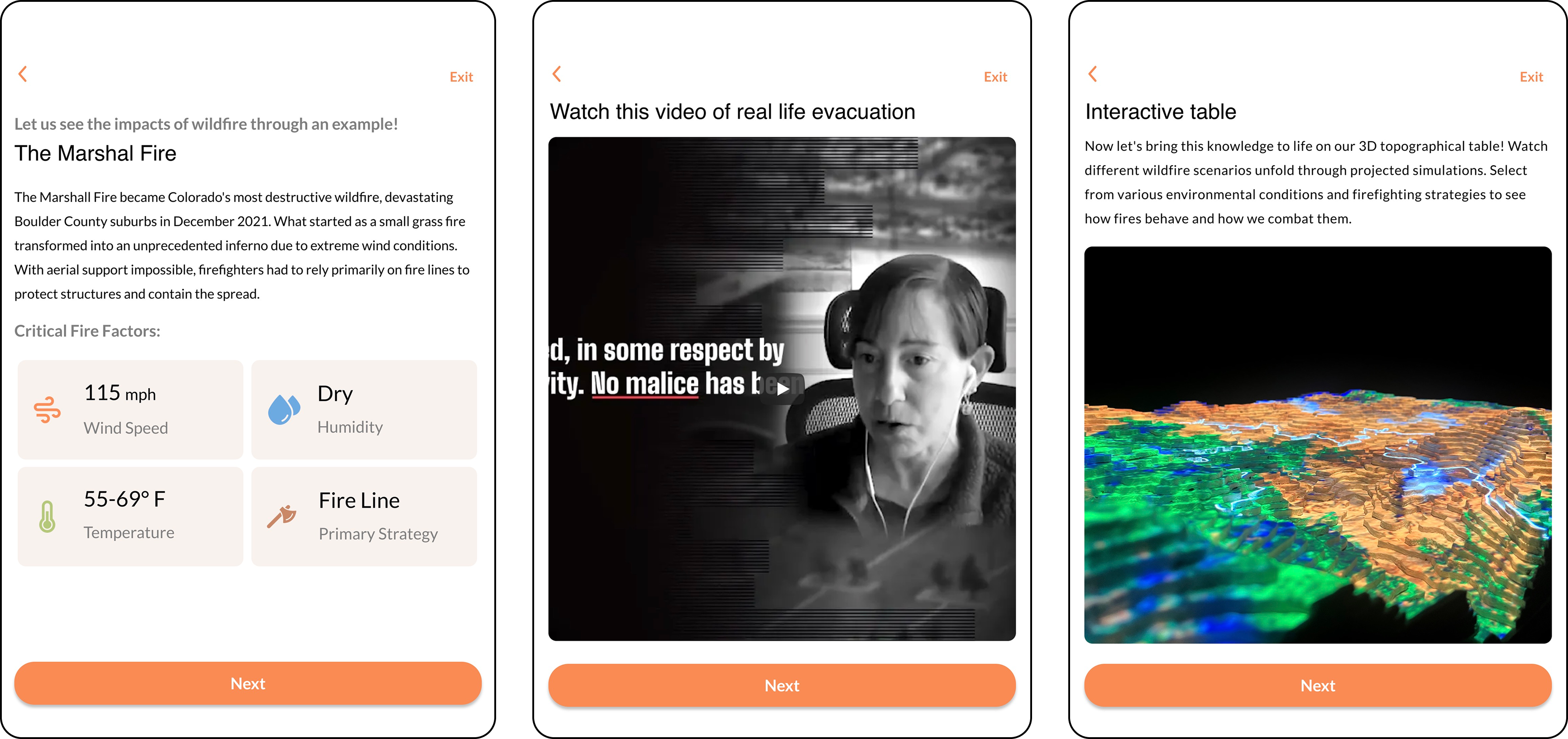
Alongside the physical table, a tablet interface gives facilitators control over exhibit state, and gives curious visitors a way to go deeper: fire science data, case studies from real events, step-by-step mode explanations.
The iPad screens went through three design phases: first a dashboard-heavy approach that overwhelmed test users, then a stripped-back information-first layout, and finally the current version, which surfaces only what's needed for the current mode.
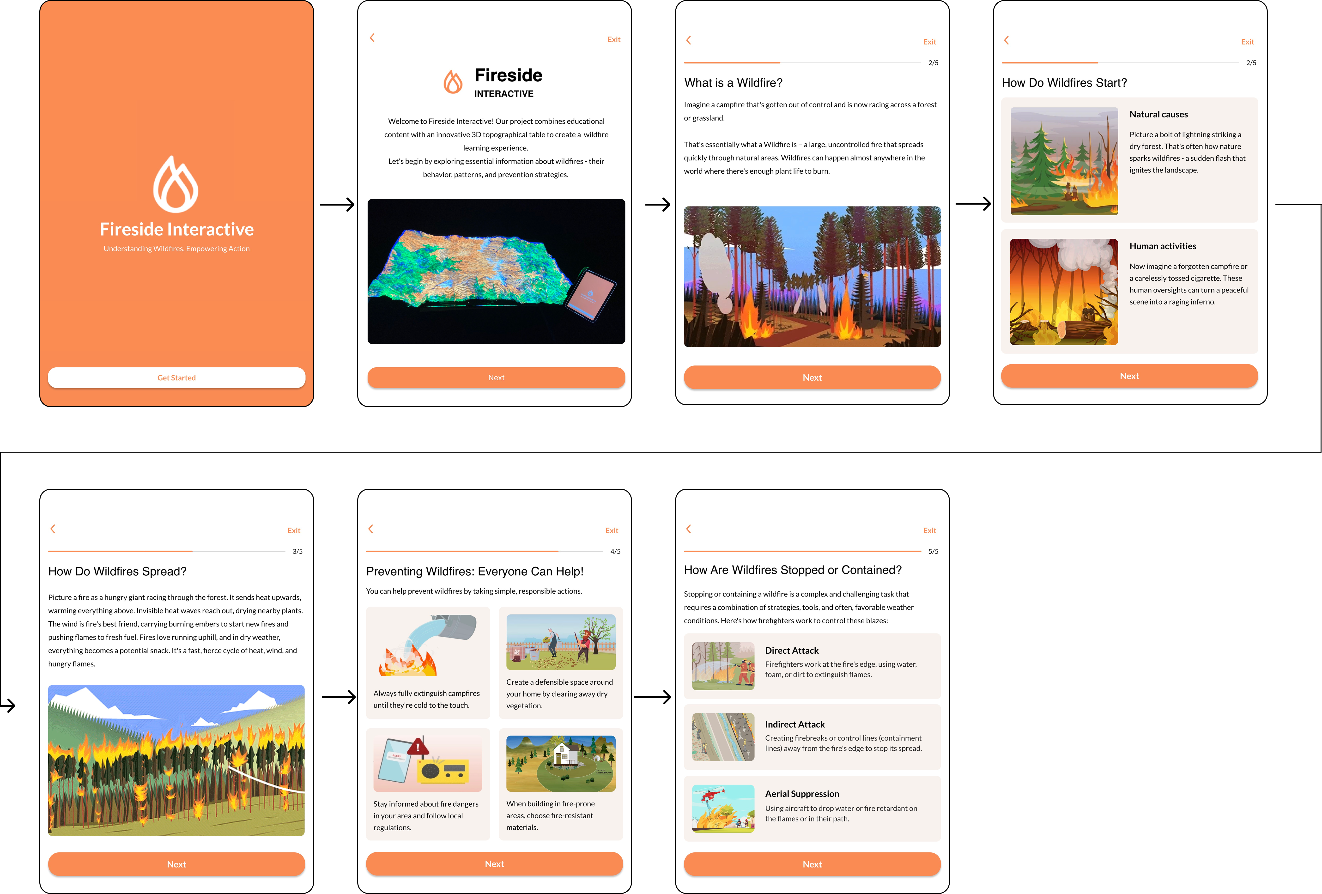
Introduction
Welcome screen with exhibit overview and mode selection, the only screen with text instructions.
Mode Control
Facilitator view: switch modes, reset simulation, set scenario difficulty. Designed for glanceable use.
Fire Data
Deep-dive panel: real fire spread data, historical case studies, and the science behind the simulation.
07 · Spatial Design
The table is the interface.
Most of the interaction design decisions were actually spatial decisions. Where you place the controls relative to where the effects appear teaches users without words. We went through four floor plan iterations before the cause-and-effect loop felt immediate.
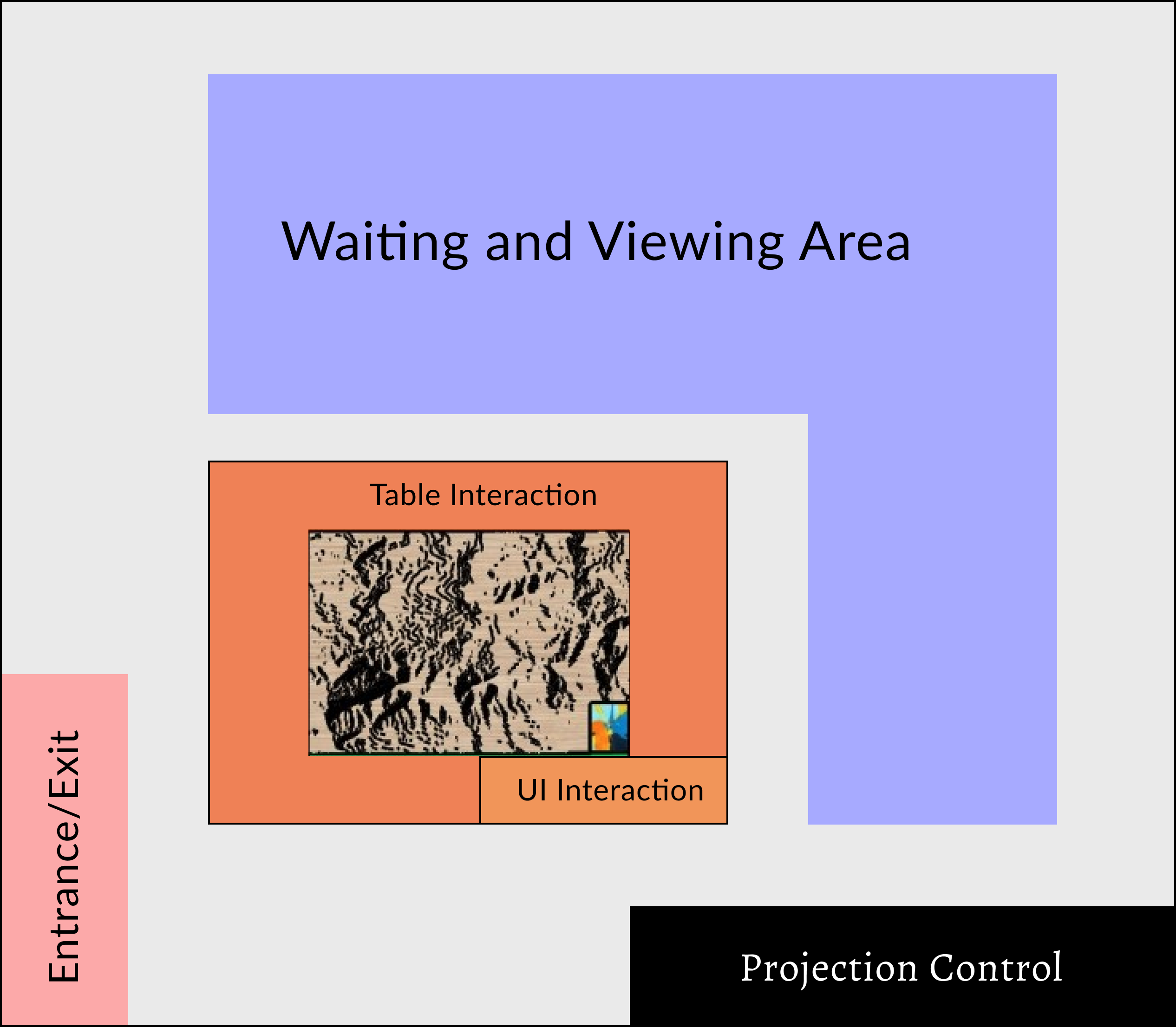
Control placement
Controls live at the table edge directly adjacent to the terrain region they affect. Wind controls on the upwind side. Suppression tools near the settlement. Nothing is abstract.
Material language
The terrain surface uses warm earth tones with high-contrast projection. At-risk zones glow amber. Active fire is red-orange. Firebreaks appear in deep blue.
Viewing zones
Designed for up to 8 people simultaneously. Primary interaction at the table. Secondary viewing zone has clear sight lines from 3 meters.
Accessibility
Table height set for wheelchair access. Controls are large-grip physical knobs, no fine motor precision required.
08 · Reflection
The hardest design problem was the one I didn't expect.
Everything I knew about interface design quietly assumed a flat rectangle. Here the canvas had hills. The projection-on-terrain constraint was genuinely hard and genuinely interesting, I'd never had to think about how pixel density changes meaning when your surface isn't flat, or how a button reads when it's cast across a slope.
Or how a control feels intuitive not because of its label but because of where it sits relative to the effect. Designing for physical space forced me to think spatially in a way that screen design never had.
At the first public deployment, a family science night at CU Boulder, a kid rotated the wind dial all the way up in Simulation Mode and watched the fire spread across the whole table in about 15 seconds. He turned to his parent and said “oh, that's why it goes that direction.” That was the whole design goal, delivered by a 9-year-old who had never seen the exhibit before. We didn't change anything after that session.