Product Design · Live Product · FlairX AI
Redesigning the Recruiter Workflow
Recruiters at FlairX were spending half a day just getting candidates into the system. I redesigned the intake flow across all three upload paths until that dropped to 30 minutes.
The challenge: Make the AI worth using without making recruiters feel like it was making decisions for them. Single upload, bulk, CSV. Three different paths, each with its own way of breaking, each with its own trust problem.
Live Product- Every candidate field typed by hand, every time
- Bulk uploads dropped data. Nobody trusted them.
- Same candidate could end up entered twice with no warning
- AI fills the form. Recruiters check it.
- Errors show up where you are, not at the end
- All three paths rebuilt at the same time
- 2 hrs → 30 min to process a résumé batch
- 130 hires sourced through the new flow
- Duplicates caught automatically, no checking required
01 · Context
The intake flow was slow and manual. I had three workflows to fix at once.
Make the whole candidate intake process faster, and make the AI that was already built into the product actually worth having.
Every field typed by hand. Every time. A recruiter couldn't start scheduling until they'd finished data entry, which could take hours depending on the batch size.
Résumé parsing, bulk uploads, and ATS integrations. All three redesigned at the same time, not one at a time.
Recruiters had to stay in control. The automation was there to save time, not to make the system feel like a black box. If it can't tell you what it did, it shouldn't do it quietly.
Founder/CEO, product team, frontend and backend engineers.
Month 1: discovery sprint (6 recruiter interviews, flow mapping, competitive audit). Month 2: design, wireframes, prototypes, 3 rounds of testing with internal users. Month 3: final designs, edge case coverage, dev handoff.
02 · The Problem
Hours of data entry before the first interview. That was the baseline.
- Every candidate field filled in by hand. The AI existed but nothing actually used it.
- No batch uploads. One résumé at a time.
- CSV uploads scrambled data. Or lost it. Recruiters stopped trusting them.
- No duplicate detection, so the same person could end up in the system twice without anyone noticing.
- The product had AI built in. Nobody used it.
“Why am I entering the same information again and again?”
These quotes came from structured interviews with 6 recruiters at FlairX during a 2-week discovery sprint at the start of the project, before any design work began.
“Why am I entering the same information again and again?”
“Bulk uploads break or miss details. I don't trust it.”
“If I make one mistake, the entire flow collapses.”
“I wish the system would just do this for me.”
- Scheduling started before anyone had finished entering the data
- No feedback while files were processing. You uploaded and waited.
- Errors showed up at the end, after all the work was already done
- Every field typed by hand, every time
03 · Ideation & Flow
Three separate workflows with enough in common to solve at once.
- Started by mapping all three areas: CSV, résumé parsing, and ATS integrations
- Ran several directions in parallel before anything got built
- Drew a clear line between what the AI should handle and what the recruiter had to decide
- Cut anything that made the recruiter do work the system could do itself
04 · Design Decisions
The four calls that actually mattered.
Cleaner field layout, restructured intake steps. But still manual. The AI was there and completely ignored. It didn't solve the right problem.
Spread upload, validation, and review across separate pages. It looked organized on paper. In testing, people kept losing track of where they were.
AI-first, not manual-first
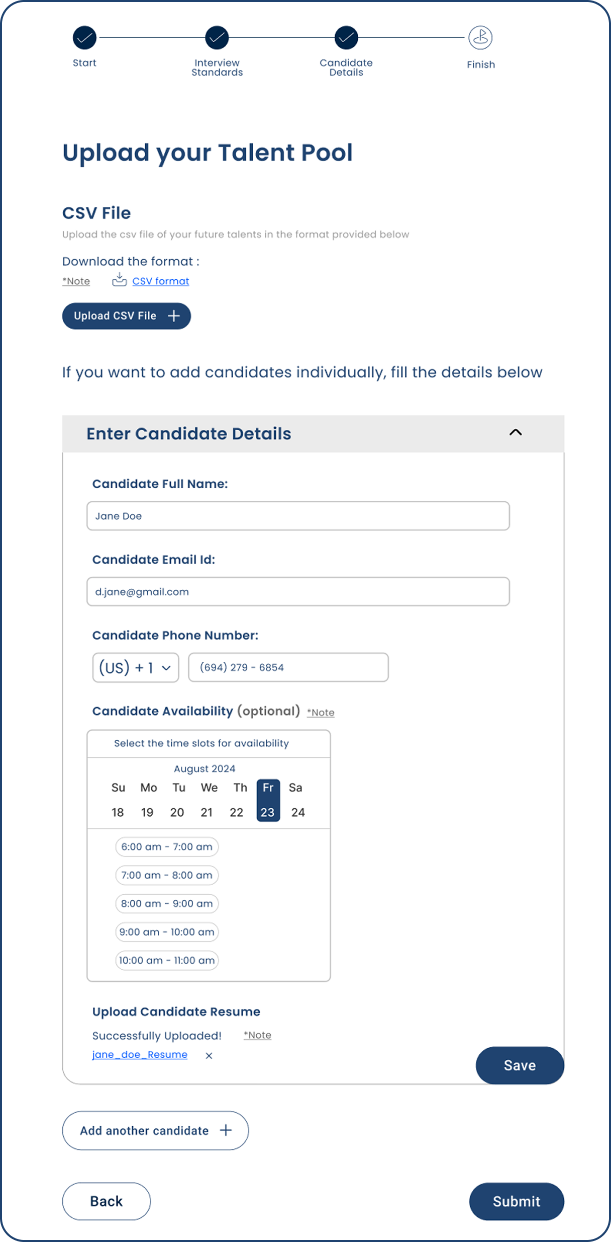
Upload a résumé, the system fills in the fields. You review what it got. You are not starting from a blank form.
If I hand you a pre-filled form and ask you to check it, that is a completely different job than handing you a blank one. You're correcting instead of creating. That shift matters more than it sounds.
I'd want to test what happens when the AI gets a field wrong. Does a wrong pre-fill feel worse than a blank? I don't actually know. That needs real data.
One page, not multiple screens
Upload, review, confirm. All one page. No back button, no losing your place.
Multiple screens failed in testing. People lost track of where they were and what was left. One long page with a clear sense of progress worked better.
I'd want to test this with someone doing 100+ candidates in a session. At that volume, a page that long might get exhausting. A stepper could work better. I haven't tested it at that scale.
Bulk as a first-class workflow
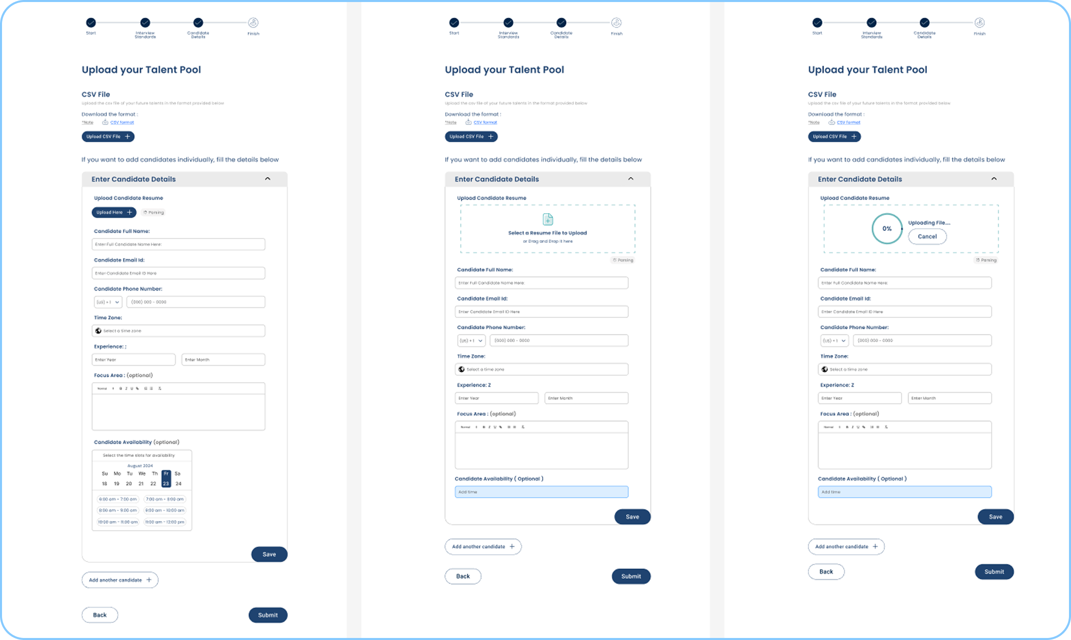
Bulk upload has its own dedicated flow: parsing progress in real time, a summary table, inline editing for anything the AI missed.
In the old system it was an afterthought. It lost data and gave you no feedback while it was working. Recruiters doing high-volume hiring needed it to actually be reliable.
Parsing everything synchronously blocks the UI on large batches. I'd look at async processing with a notification when it finishes so recruiters can do something else while they wait.
Errors where they happen
If a field is wrong or missing, it shows in the review table right where the problem is. Nothing blocks you until you have actually seen the issue.
A separate error screen means stopping, reading a list, then going back. Inline means you fix the phone number while you're looking at that row. Much less switching around.
I'd add undo for dismissed warnings. Recruiters close things by accident, and right now the only way to get that back is to reprocess the whole file.
05 · Final Designs
What each upload path actually looks like.
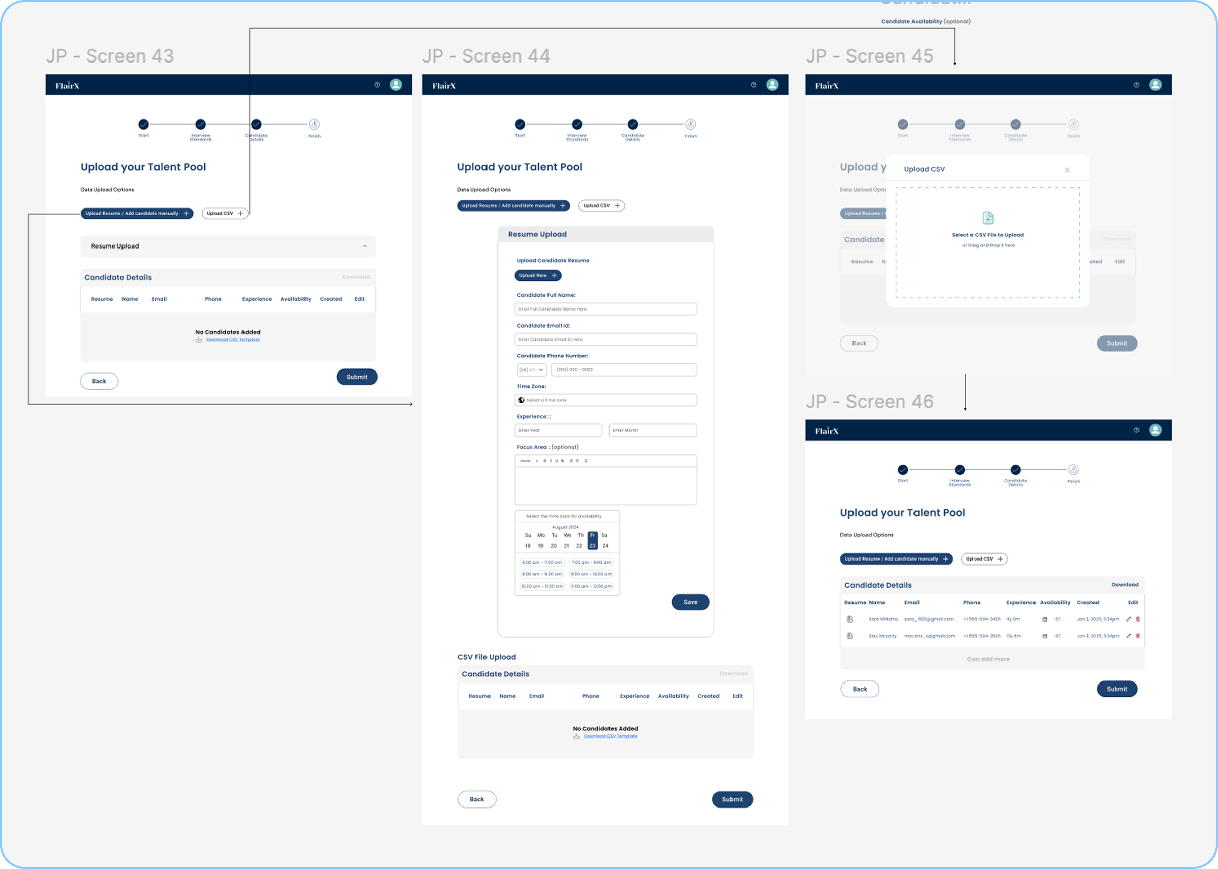
Single upload
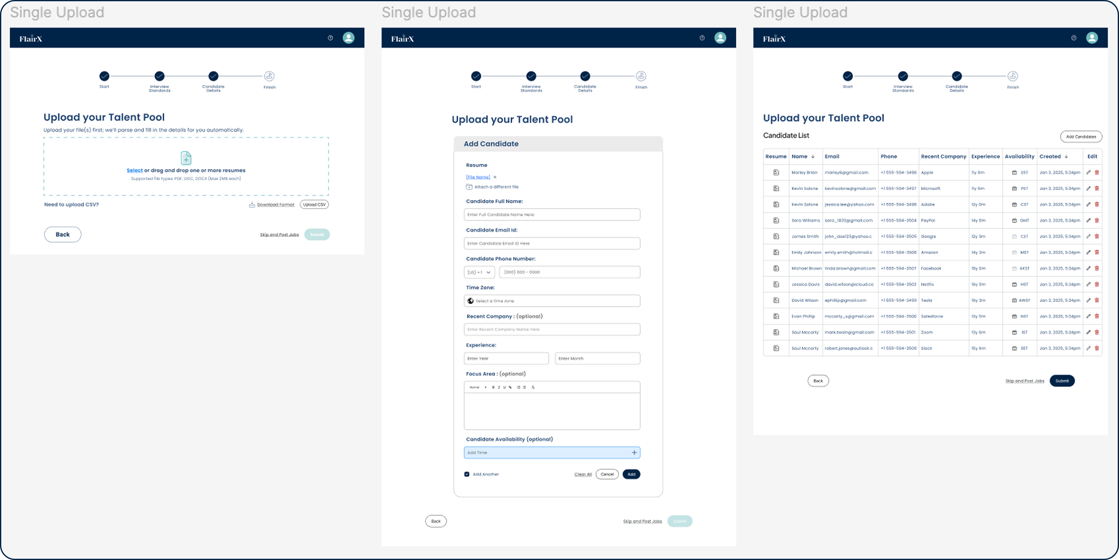
- Drop in a résumé, the system fills in the fields
- Review what it got right. Fix what it missed.
- One page: upload, review, confirm
- You are editing, not entering from scratch
Bulk upload
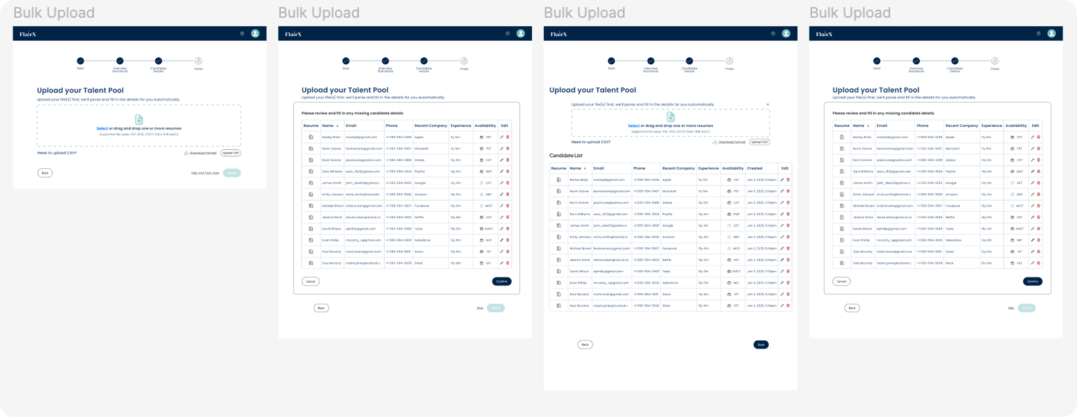
- Drop in a batch of résumés, all processed at once
- Parsing progress shows in real time as files come through
- Incomplete fields show inline in the review table
- Fix errors directly in the table, no separate forms
CSV upload
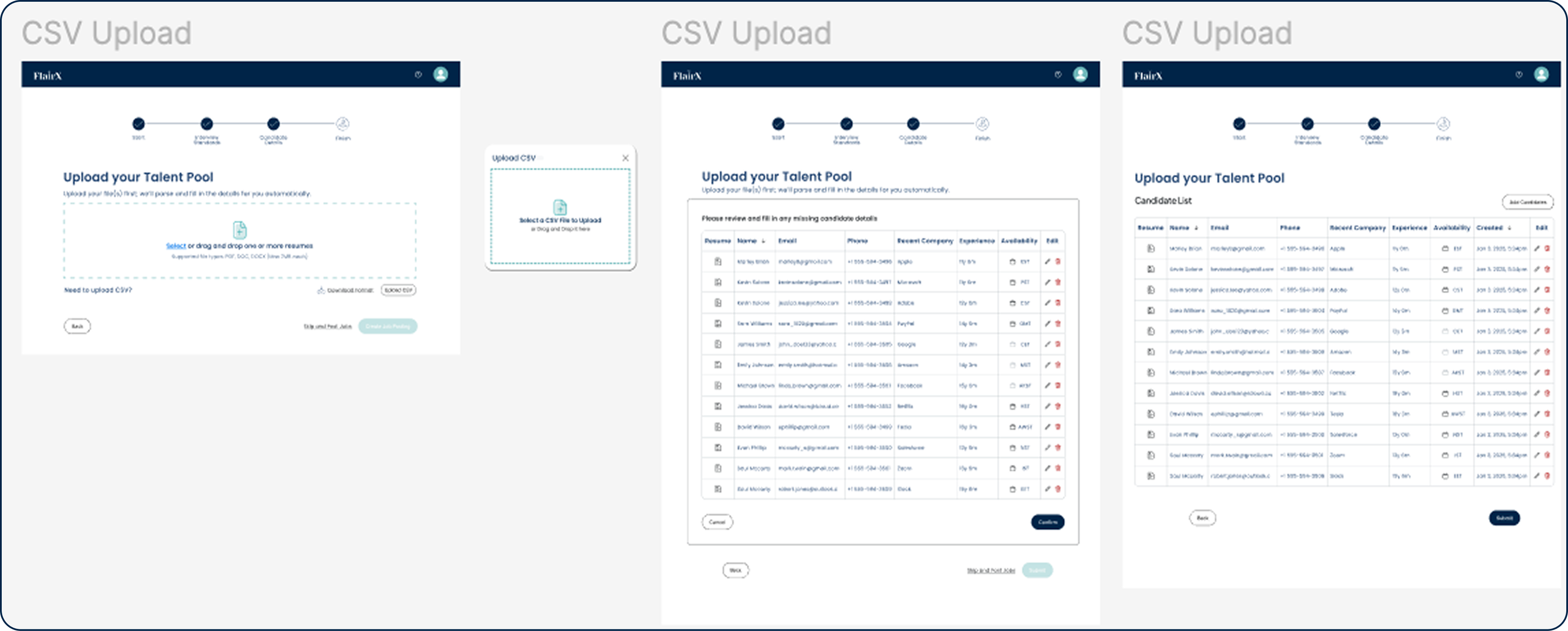
- For teams who work from spreadsheets
- System maps CSV columns to candidate fields automatically
- Mismatches show before any data gets committed
- Fix conflicts inline before anything is imported
06 · Stage 3 · ATS Integration
What connecting to an ATS would look like.
Stage 3 was the most technically opaque part of the flow for recruiters. They knew they needed their ATS data in FlairX, but had no mental model for how that transfer would work. This is what I designed for it: a flow where you can see exactly what's being pulled, which fields map where, and confirm before anything lands in the pipeline.
Stage 3 · ATS Integration · interactive prototype, click through the full flow
07 · Edge Cases
Real hiring doesn't go smoothly. The system had to be ready for that.
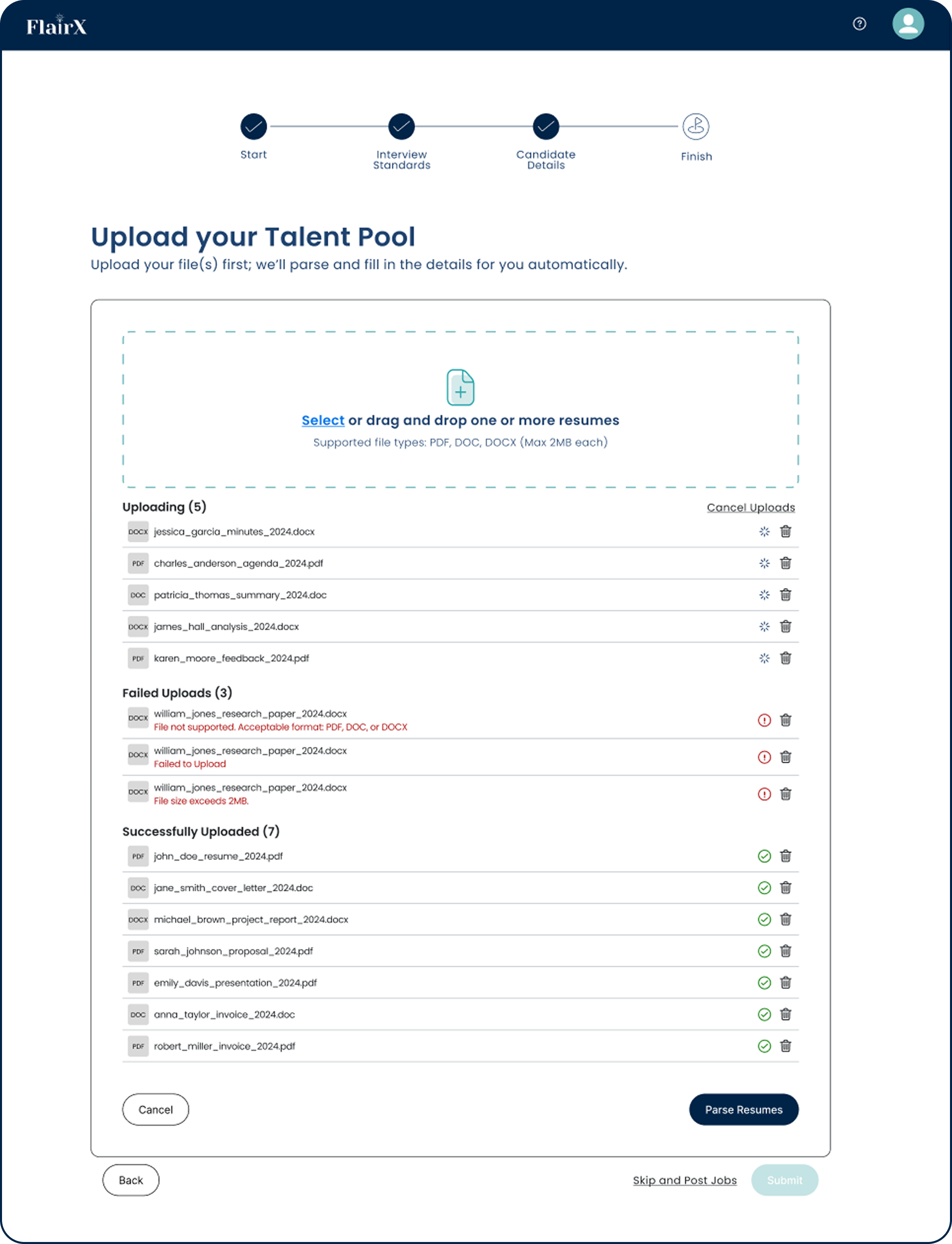
- One file failing does not stop the others
- Files split into three states: uploading, failed, done
- Parsing stays locked until everything that can be processed is finished
- Cancelling only stops what is still uploading. Completed files stay.
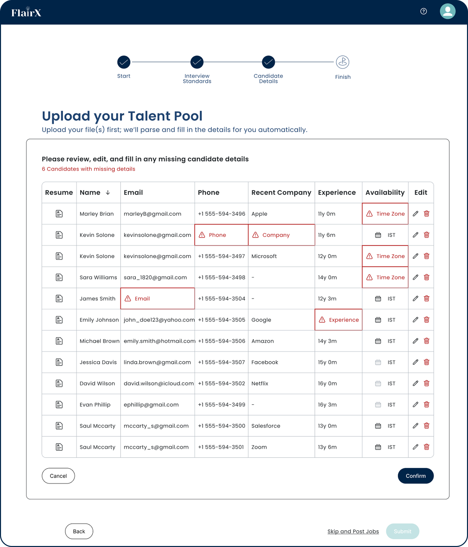
- Required fields the AI could not extract show inline in the review table
- Only the broken fields get flagged. Everything else stays clean.
- Fix it in place, without opening anything else
- What used to mean starting over now takes a few seconds
- Stops you losing work if you navigate away mid-upload
- Won't let a job post until the candidate data is actually ready
- Nothing bad gets in quietly
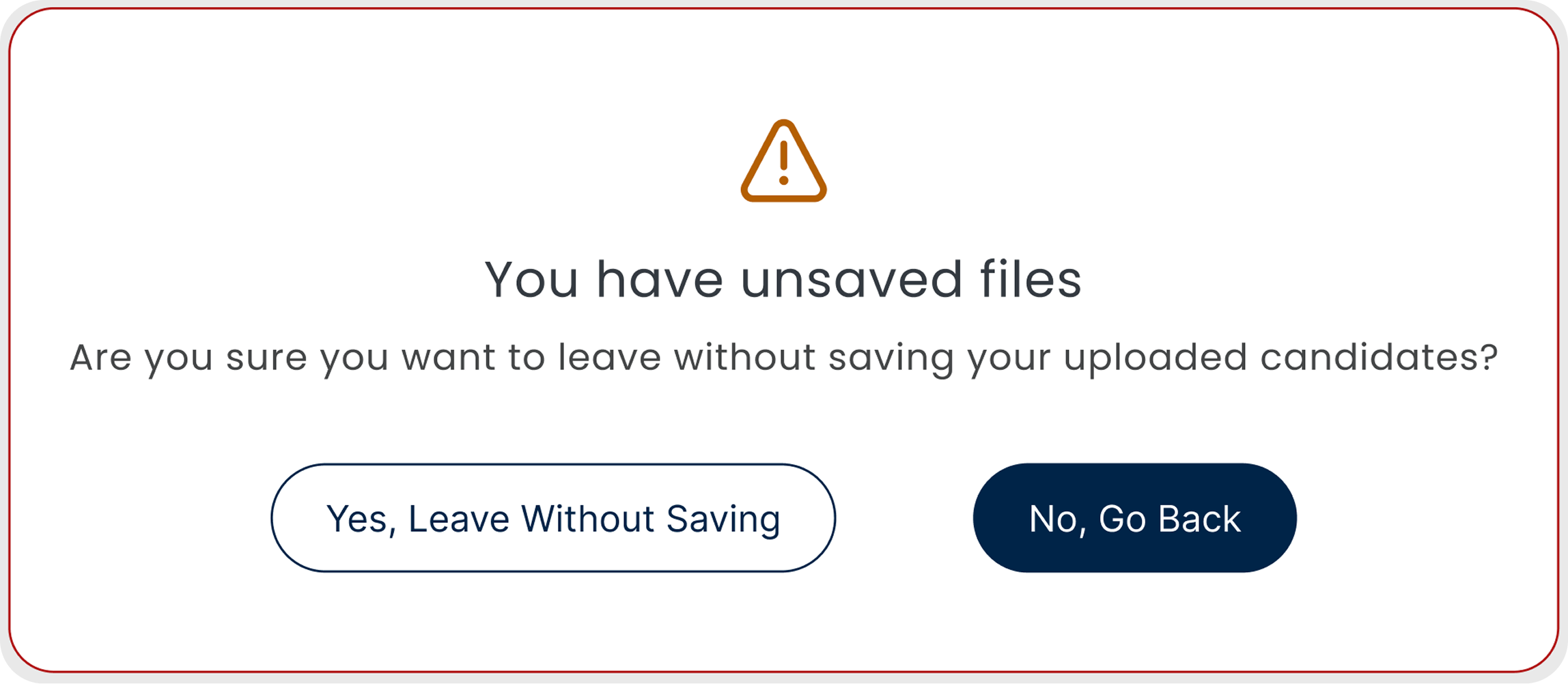
Unsaved files warning
- Shows if you try to leave mid-upload
- Makes you confirm before anything is discarded
- Same behavior in bulk and single sessions
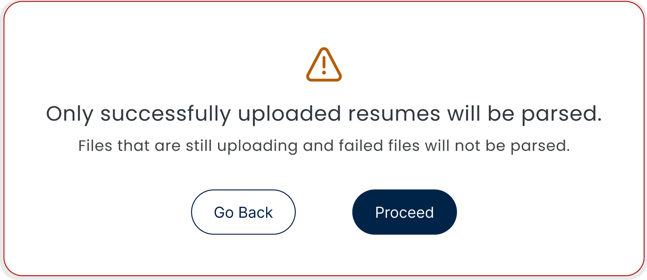
Failed files notice
- Shows exactly which files failed or are still processing
- Failed files are skipped at the parsing step automatically
- You know before you move on, not after
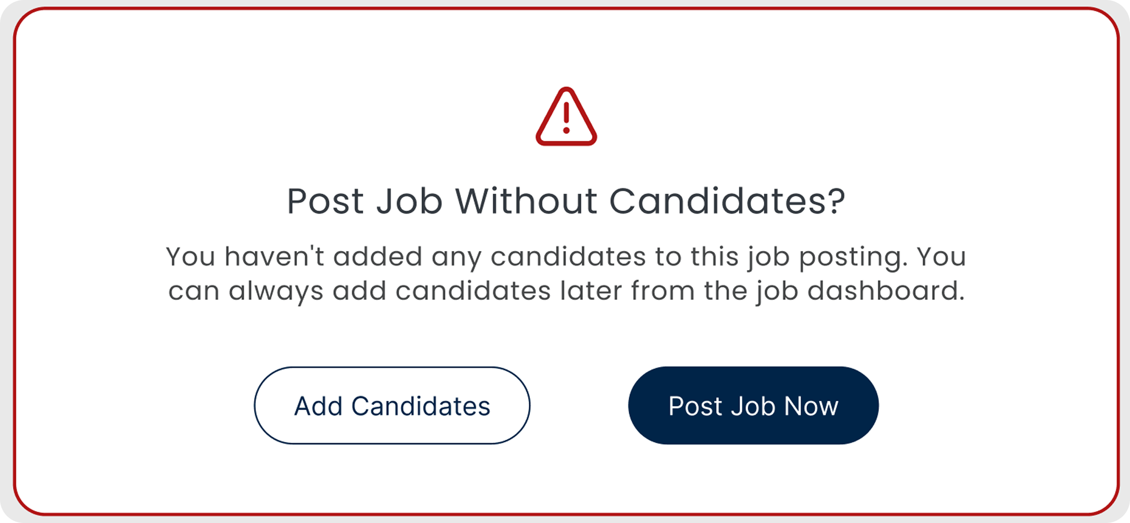
Empty pipeline warning
- Fires if you try to post a job with no candidates
- Makes you add at least one candidate first
- A simple check that catches an embarrassing mistake

Required fields block
- Submission is locked until required fields are filled
- Shows exactly which fields are missing, right there in the row
- Nothing incomplete gets into the system
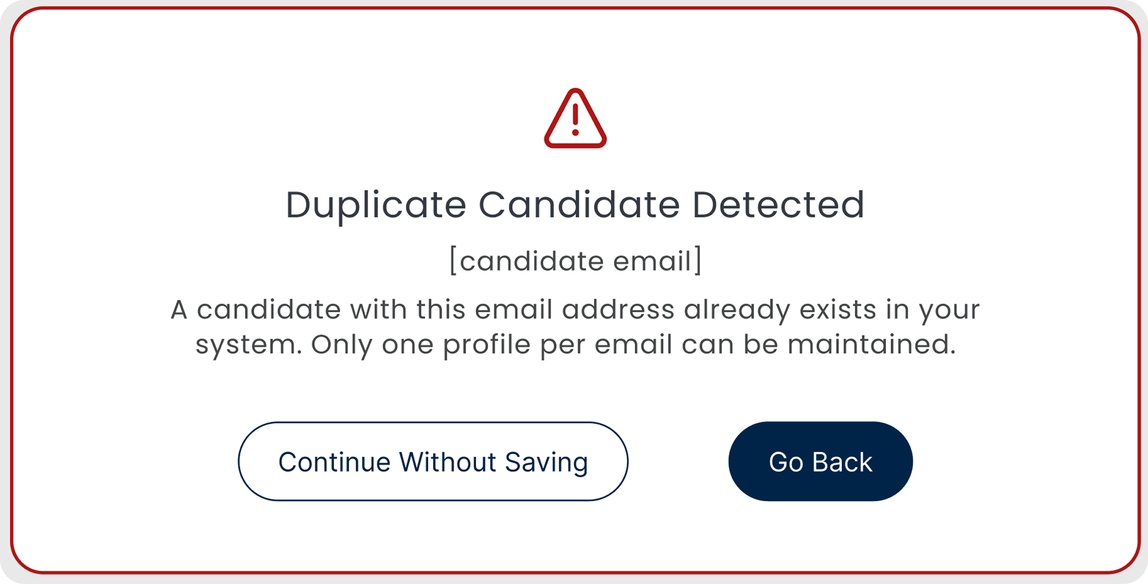
Duplicate detection
- Checks if the candidate already exists before adding them
- Flags the duplicate before it lands in the pipeline
- Keeps the database clean without anyone having to look
08 · Impact
It shipped, it worked, and it changed how the team hired.
2 hrs → ~30 mins
Processing a batch of résumés went from half a day to a coffee break.
130 hires through the flow
130 candidates were hired from roles sourced and processed entirely through the redesigned intake flow in the first six months (founder-reported, from pipeline data). The redesign owns the intake, not the hiring call, but every one of those hires moved through it.
Duplicates eliminated
The system catches repeated entries automatically. Nobody has to check by hand anymore.
Bulk uploads got reliable
Recruiters stopped dreading high-volume days. They knew what was happening at every step.
09 · Handoff
What the engineers actually received.
The design handoff covered all three upload paths, every edge case, and the full alert system. Engineers received a Figma file with component-level annotations, interaction states documented in Notion, and a Jira ticket per feature with acceptance criteria written against observed user behavior, not against design spec.
Figma component library
Every screen in the intake flow built from reusable components with explicit state coverage: default, hover, loading, error, success, disabled.
Interaction annotations
Inline notes on every non-obvious behavior: what triggers the duplicate detection, what cancels an in-progress upload, how the AI confidence threshold maps to the review table display.
Edge case matrix
A documented matrix of every failure mode we designed for: mixed upload states, AI misses, unsaved files warning, empty pipeline. Expected behavior for each.
10 · Reflection
The hardest design call was knowing when to stay quiet.
Showing AI reasoning on every card created noise that made people trust the system less, not more. Early prototypes showed everything: the confidence score, the extracted fields, the source data. Recruiters didn't feel informed. They felt watched.
The final design shows its reasoning only when confidence is low, or when a recruiter stops to look. When the AI is sure, it just fills the field. When it's not, it flags it. That calibration wasn't in the brief. It came out of watching people use the early version and noticing where they flinched.
I'd want to sit with recruiters doing 100+ candidates in a day. The single-page flow works fine at normal volume, but at that scale it might get exhausting. A stepper with clear checkpoints could work better. I haven't tested it and I don't know for sure.